 Redefine Docs
Tabs Module
Add switchable content panes with accessible tab navigation.
Tabs let readers switch between multiple content panes without leaving the page.
Demo
Basic syntax
{% tabs %}

<!-- tab First -->

Content for tab 1

<!-- tab Second -->

Content for tab 2

{% endtabs %}
<!-- endtab --> is not required.
Tabs arguments
name/id: optional. If omitted, the theme automatically generates a tabs id.active: active tab index (1-based). If omitted or invalid, the first tab is active.
{% tabs active=2 %}
...
{% endtabs %}
Legacy positional forms are still supported:
{% tabs feature-tabs::2 %}
{% tabs feature-tabs,2 %}
Tab header formats
Simple header:
<!-- tab Overview -->Named header arguments:
<!-- tab title="Overview" icon="<i class='fa-solid fa-book'></i>" -->caption="..." is also accepted as an alias of title.
Full example
{% tabs %}
<!-- tab First Tab-->
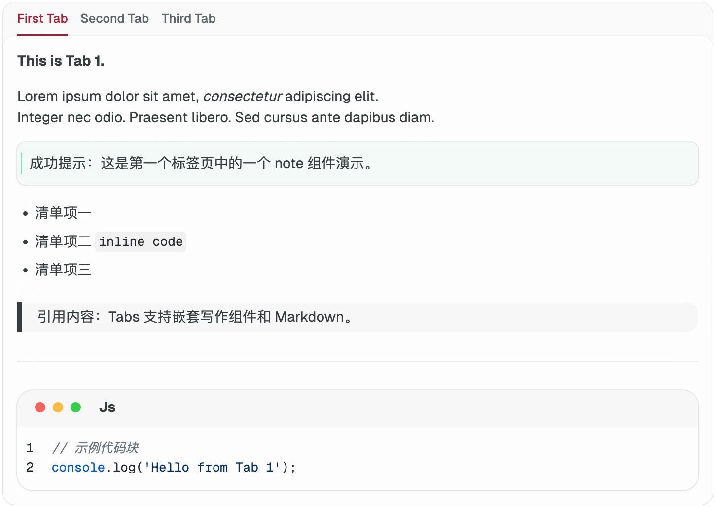
**This is Tab 1.**
Lorem ipsum dolor sit amet, _consectetur_ adipiscing elit.
Integer nec odio. Praesent libero. Sed cursus ante dapibus diam.
{% note success %}
成功提示:这是第一个标签页中的一个 note 组件演示。
{% endnote %}
- 清单项一
- 清单项二 `inline code`
- 清单项三
> 引用内容:Tabs 支持嵌套写作组件和 Markdown。
---
```js
// 示例代码块
console.log("Hello from Tab 1");
```
<!-- tab Second Tab-->
**This is Tab 2.**
> “Lorem ipsum dolor sit amet, consectetur adipiscing elit.”
{% folding blue::点击展开更多内容 %}
隐藏内容演示:Vivamus sagittis lacus vel augue laoreet rutrum faucibus dolor auctor.
{% endfolding %}
| 列1 | 列2 |
| ------ | ----- |
| 内容 A | Lorem |
| 内容 B | Ipsum |
```
$ pnpm run build
```
{% notel warning 注意 %}
这里有一个 warning note 组件,带图标。
{% endnotel %}
<!-- tab Third Tab -->
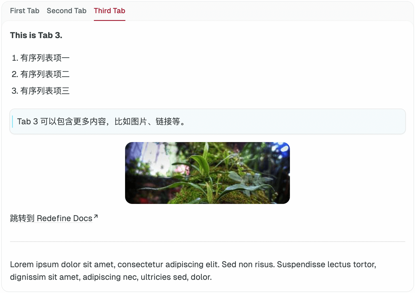
**This is Tab 3.**
1. 有序列表项一
2. 有序列表项二
3. 有序列表项三
{% note info %}
Tab 3 可以包含更多内容,比如图片、链接等。
{% endnote %}

[跳转到 Redefine Docs](https://redefine-docs.ohevan.com)
---
Lorem ipsum dolor sit amet, consectetur adipiscing elit. Sed non risus. Suspendisse lectus tortor, dignissim sit amet, adipiscing nec, ultricies sed, dolor.
{% endtabs %}More
For a live experience, please visit the Redefine Demo Site.
Last updated on